Penguin
Posted: May 12, 2017 Filed under: Field Leave a commentAt the start of this project, we were given the option of either designing a cover for In Cold Blood, by Truman Capote, or The Secret Diary of Adrian Mole Aged 13¾, by Sue Townsend. I knew that pretty much straight away that I wanted to work on In Cold Blood. My portfolio has been full of illustration and silly, fun work, so I wanted to avoid doing yet another project like that.
I started with visual research, looking at past In Cold Blood covers and looking at covers that I thought were striking/interesting.


I didn’t know a thing about the book and I knew that, at the speed I read, I wouldn’t be able to read it before the project was over, so I looked at a lot of cliff notes for my research. Even though I knew it was about the writing of the story, as apposed to the story itself, I watched the 2005 film Capote. I didn’t really find the film very helpful, but the rest of the research gave me a fair bit to work with.


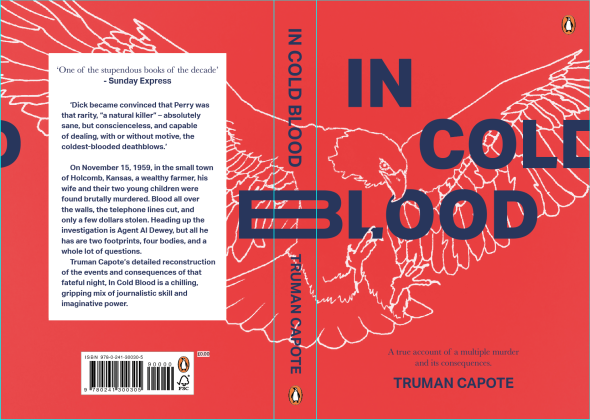
After a tutorial with Anna, one idea really stood out. The idea was to have an image of an Eagle, swooping down as if about to catch something, because the main character of the book, Perry, had a reoccurring dream of a giant eagle swooping down and taking him away. He had this dream because he had always had a terrible life and the eagle seemed to be his wish for an end to it all. I had planned to illustrate the eagle in the style of illustrations on dollar bills, to also nod to the reason they went into the family’s house in the first place, but I decided that this would take far too long. I then did some research, looking at different illustrations, trying to pick out a style that I thought could work.
I picked out a particular style and started trying to do something similar. When I finished the outline of the eagle, I decided to place it into the document I had, so that I could start playing about with layout too. I’m really glad I did this, because I actually ended up preferring the line drawing of the eagle.


I played about with the layout of it a bit and produced my first outcome for the presentation.
I didn’t really get many comments. One person said that the text on the back needs work and I agreed because I only settled for the design on the back cover to meet the deadline of the presentation. Other than that, nobody really said anything. I find tutorials quite frustrating because I try to make sure I say what I think about other people’s work as I know that without people saying something needs changing, the problems quite often go unseen. But, I feel like a lot of people in my class don’t do this. I always get the feeling in tutorials that people are either saying nothing because they’re afraid of hurting somebody’s feelings, or they’re just not interested.
One rather fortunate thing from the presentation was actually a printing error. For some reason, the printer printed my work with a gradient, making the bottom half of my work a lot lighter. Although I was annoyed at the printer at first, I actually quite liked the gradient, so thought I’d try to emulate it when working on the cover more.
Between the presentation and the competition I mostly worked on the design of the back cover. I’m not really that interested in books, so I’d never really paid any attention to what was a good design for a back cover. I tried a lot of iterations before finally settling on one I thought worked fairly well.
I was pretty happy with my final cover! Considering I rarely do cover designs, I think I’ve managed to produce something fairly good. The brief asked for a design that was striking and would stand out on a shelf. I think I’ve managed to do that.
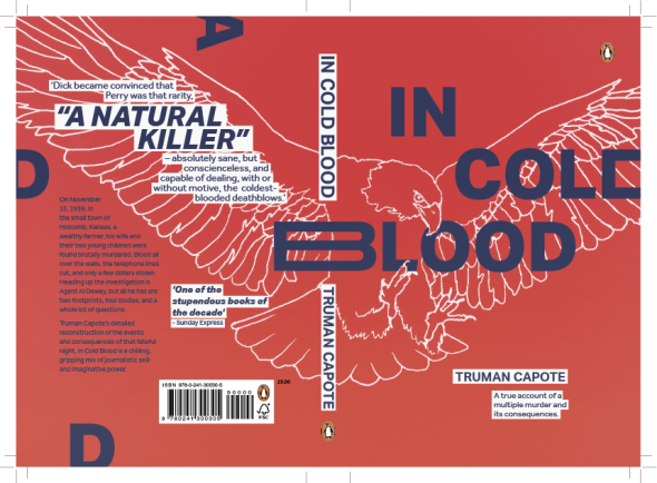
I was a little bit disappointed to not get shortlisted. I felt that my cover had a strong design and, although the back cover could still do with a little bit of work, I’ve produced something that I’m happy with.
